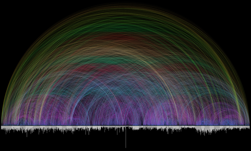
What happens when the Bible gets in the hands of the data gods? It comes to life in a series of astonishing infographics that were recently shared by The Guardian.
From playing with word counts to timelines to sentiment analysis – Here is the good book in pictures:


More at the Guardian: Holy infographics: the bible visualised

